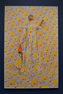
The artist of the photo "Lost In My Life" was taken by Rachel Perry Welty in 2009. Welty is a conceptual artist from Boston, Massachusetts that concentrates in photography as well as drawing, sculpture, video, and installation. She uses various materials to construct the background of her images.The backgrounds she creates communicate various issues such as consumerism, narcissism, life, and death.
Since I'm assuming this was taken in a studio with professional lighting, the light is evenly distributed through the image, rather than it falling onto one part of the photo. Due to the even distribution of light, there aren't very noticeable highlights or shadows. The photo is taken from eye level, focusing directly on the subject in the center of the frame. In a way, this violates the rule of thirds, but is effective in bringing attention directly to the model. The elements of colour is very evident in this piece; the vivid colours of the price tags contrast with the fair tones of her skin and hair. By utilising bright yellow, orange, and blue, it helps to evoke an exuberant feeling in the viewer, which perhaps may not be possible if the photo were in black and white. By placing the subject in the middle of the image and having the rest of the frame “empty,” so to speak, it creates a sense of space. The pattern that Welty has created consists of chunks of yellow and white tags, which is repeated throughout the image and creates rhythm and movement. This pattern also manages to create a sense of texture when it’s viewed in person. When the docent at DeCordova took us to view this image at full size in the gallery, it felt as if I could reach out and peel the stickers off individually. When our docent explained to us that it was actually a photo, he received a series of “oohs” and “ahhs” in return. I’m unsure if the texture is created because of the pattern, colour, or both, but overall it generates a lively response.
This image by Welty has a simple yet complex composition. The viewpoint and placement of the model is simplistic, however the pattern of the sales tags is extremely intricate. It’s unclear whether Welty used photo manipulation to create the background or put it together hand by hand. Either way, the image is unique and complex. The point of view that was used to photograph the subject may be common but allows the viewers to focus more on the message that the background, and image as a whole, is expressing. The combination of colour and space create contrasting feelings of joy and melancholy; the bright colours creating happiness, while the space around her makes her look as though she’s lost and miniscule compared to the background.
There’s much more to the photo than meets the eye; so many stories are compressed into this one photograph that may look simple at first glance. In today’s society, we are constantly surrounded by advertisements that pressure us to live lives of luxury. Billboards, magazines, commercials, etc, that make us feel that we need certain items in order to fit in. Blending in with the people around us, as Welty does with the background, is a common thing today. Media sometimes negatively influences us and convinces us into thinking that we have to fit a cookie-cutter mold in order to be deemed socially acceptable. This image also shows the viewer that this lifestyle isn’t possible for some people. The condition of our economy has put so many families out of work that sometimes it doesn’t allow for us to conform to this social standard of luxury and elegance. The melancholic feeling I get when looking at this is brought on by the amount of sales tags; the endless sea of yellow, white, blue, and orange, reminding me of parents that try their hardest to provide these luxurious items to their children to help them to fit in, while constantly having to worry about bills and budgeting. However, it could be interpreted on the complete opposite end of the spectrum, telling the story of someone with a shopping addiction, poking fun at us for our common addiction to shopping and the “must have” attitude that some people have towards these products the media is constantly pushing into our faces.
The most successful part of this image is the pattern of the background and the rhythm it creates, as well as the story behind the image itself. I don’t necessarily believe that there’s anything the photographer could do to the image to improve it. Often in art many forms of art, you reach a standstill where you can change things all you want, but it doesn’t necessarily improve what you’re working on. If Welty changed anything in the image, it may become too busy than it already is with the background, although the point of view and position of the model is very simplistic. This image was by far one of my favourite of the photographs at DeCordova because of the overall composition and the many different ways that it can be interpreted by the viewers.
